
Visual Merchandising Fundamentals
Expert-defined terms from the Certificate in Retail Display and Presentation course at LearnUNI. Free to read, free to share, paired with a professional course.
Anchor Display – Concept #
The primary visual focal point in a window or store layout that draws customer attention. Related terms: Focal Point, Feature Display. Explanation: An anchor display is strategically placed to showcase a key product or brand message, often using height, contrast, or lighting to dominate the visual field. Example: A luxury watch brand positions a large, illuminated timepiece on a pedestal at the center of the front window. Practical application: Use the anchor to introduce seasonal themes, then arrange complementary items around it to create a cohesive story. Challenges: Maintaining relevance across changing promotions while avoiding visual clutter that can dilute the impact.
Aisle Planning – Concept #
The organization of floor space between fixtures to facilitate traffic flow and product exposure. Related terms: Traffic Patterns, Store Layout. Explanation: Effective aisle planning balances shopper comfort with merchandising goals, ensuring that high‑margin items receive optimal sightlines. Example: A supermarket creates wide main aisles for carts and narrower “gallery” aisles for specialty foods. Practical application: Map customer pathways using heat‑map data, then adjust aisle widths to guide shoppers past promotional zones. Challenges: Limited floor space, competing needs of accessibility standards, and the risk of “dead‑ends” that reduce exposure.
Ambient Lighting – Concept #
General illumination that sets the overall mood of a retail space. Related terms: Accent Lighting, Color Temperature. Explanation: Ambient lighting provides even, non‑directional light, influencing perceived product quality and shopper comfort. Example: A boutique uses warm‑white LEDs to create an inviting atmosphere that complements earthy product tones. Practical application: Select lighting fixtures that match the brand’s color palette and ensure consistent illumination across displays. Challenges: Balancing energy efficiency with aesthetic goals, and preventing glare that can obscure product details.
Balance (Visual) – Concept #
The distribution of visual weight within a display to achieve harmony. Related terms: Symmetry, Asymmetry. Explanation: Balance can be symmetrical (mirrored elements) or asymmetrical (different items that still feel stable). Example: A cosmetics counter places a tall perfume bottle on one side and a cluster of smaller makeup kits on the opposite side, achieving asymmetrical balance. Practical application: Arrange products so that eye movement is naturally guided across the display without feeling lopsided. Challenges: Over‑balancing can lead to monotony, while under‑balancing may cause visual tension and distract shoppers.
Brand Storytelling – Concept #
Communicating a brand’s narrative through visual cues and product arrangement. Related terms: Brand Identity, Visual Narrative. Explanation: Storytelling aligns displays with the brand’s heritage, values, or lifestyle promise, fostering emotional connections. Example: A heritage denim brand uses vintage sewing tools, reclaimed wood, and a backdrop of historical photographs to convey its craft tradition. Practical application: Develop a storyboard for each seasonal campaign, translating key messages into colors, props, and signage. Challenges: Ensuring authenticity, avoiding clichés, and keeping the story consistent across multiple touchpoints.
Color Theory – Concept #
The study of how colors interact and affect perception. Related terms: Complementary Colors, Color Harmony. Explanation: Understanding primary, secondary, and tertiary relationships helps merchandisers create appealing palettes that influence mood and buying behavior. Example: A summer swimwear display uses a triadic scheme of turquoise, coral, and sunshine yellow to evoke beach energy. Practical application: Choose a dominant color for the anchor, then apply supporting hues to secondary items, maintaining visual cohesion. Challenges: Cultural variations in color meaning, and the difficulty of maintaining consistency across varied product ranges.
Contrast – Concept #
The difference in visual elements such as color, size, or texture that makes objects stand out. Related terms: Visual Hierarchy, Emphasis. Explanation: High contrast draws attention, while low contrast creates subtlety; both are tools for guiding shopper focus. Example: A black‑and‑white photo backdrop highlights a bright red handbag, creating immediate visual impact. Practical application: Use contrast strategically to prioritize new arrivals or high‑margin items. Challenges: Excessive contrast can overwhelm the viewer, and insufficient contrast may render displays invisible.
Cross‑Merchandising – Concept #
Placing complementary products together to encourage additional purchases. Related terms: Impulse Buying, Product Pairing. Explanation: By aligning related categories, retailers stimulate associative thinking, increasing basket size. Example: A coffee aisle displays mugs, flavored syrups, and coffee beans side by side. Practical application: Analyze sales data to identify high‑conversion pairings, then design displays that physically connect those items. Challenges: Space constraints and the risk of confusing shoppers if pairings appear forced.
Customer Journey Mapping – Concept #
Visualizing the steps a shopper takes from awareness to purchase. Related terms: Touchpoints, Experience Design. Explanation: Mapping reveals moments where visual merchandising can influence decisions, such as entry points, decision zones, and checkout areas. Example: A map shows that customers linger near the entrance, then proceed to a central island before heading to the register. Practical application: Position high‑margin items in the “decision zone” identified on the map. Challenges: Accurately capturing behavior across diverse shopper segments and updating the map as store layouts evolve.
Display Fixtures – Concept #
Physical structures that hold and present merchandise. Related terms: Mannequins, Shelving. Explanation: Fixtures range from simple shelves to elaborate custom-built units, each influencing product visibility and shopper interaction. Example: A modular grid system allows retailers to reconfigure shelf heights for seasonal footwear. Practical application: Choose fixtures that complement product dimensions and brand aesthetics while maximizing floor efficiency. Challenges: Budget limitations, durability concerns, and ensuring fixtures comply with safety regulations.
Focal Point – Concept #
The element within a visual composition that attracts the most immediate attention. Related terms: Anchor Display, Visual Hierarchy. Explanation: Focal points are created through size, color, lighting, or placement, serving as the entry for the shopper’s visual journey. Example: A large, illuminated signage announcing a flash sale acts as the focal point in a window. Practical application: Design each window with a clear focal point, then cascade supporting elements outward. Challenges: Over‑reliance on a single focal point can cause other products to be ignored, and frequent changes can dilute brand consistency.
Floor Plan – Concept #
A scaled diagram showing the arrangement of fixtures, aisles, and zones within a retail space. Related terms: Store Layout, Space Allocation. Explanation: The floor plan guides traffic, influences dwell time, and determines product exposure. Example: A “racetrack” layout forms a loop that encourages shoppers to pass by all departments. Practical application: Use CAD software to draft floor plans, then simulate shopper flow to identify bottlenecks. Challenges: Adapting plans to real‑world constraints such as structural columns, and balancing aesthetic appeal with functional efficiency.
Focal Length (Photography) – Concept #
The distance between a camera lens and its sensor, affecting image perspective in visual merchandising photography. Related terms: Depth of Field, Composition. Explanation: Short focal lengths create wide angles that can exaggerate product size, while long focal lengths compress space for a tighter look. Example: A wide‑angle shot of a window display emphasizes the breadth of the arrangement. Practical application: Train visual merchandisers in basic photography techniques to capture compelling images for marketing. Challenges: Managing distortion that may misrepresent product dimensions, and ensuring consistency across brand assets.
Graphic Signage – Concept #
Printed or digital visual communication used to convey information, branding, or promotions. Related terms: Wayfinding, Point‑of‑Sale (POS) Displays. Explanation: Effective signage integrates typography, color, and imagery to guide shoppers and reinforce messaging. Example: A bold, sans‑serif tagline in high‑contrast colors points customers toward a new collection. Practical application: Align signage style with overall brand guidelines and place it at decision points identified in the customer journey map. Challenges: Maintaining legibility from varying distances, and updating signage quickly for time‑sensitive promotions.
Group Theory (Visual) – Concept #
The principle of arranging items in logical clusters to create meaning and ease of navigation. Related terms: Category Management, Visual Grouping. Explanation: Grouping can be based on function, theme, or color, helping shoppers locate related products faster. Example: A travel accessories section groups passport holders, luggage tags, and travel‑size toiletries together. Practical application: Use signage and shelf dividers to reinforce groups, enhancing perceived organization. Challenges: Over‑grouping can limit exposure of individual items, while under‑grouping may cause shopper confusion.
Heat Map Analysis – Concept #
Visual representation of shopper traffic intensity within a store, often derived from video or sensor data. Related terms: Customer Flow, Analytics. Explanation: Heat maps highlight high‑traffic zones (hot spots) and low‑traffic zones (cold spots), informing placement decisions. Example: A heat map shows that the central island receives the most footfall, prompting the placement of a new product line there. Practical application: Integrate heat‑map insights with visual merchandising plans to maximize exposure of high‑margin items. Challenges: Data privacy concerns, the need for continuous data collection, and interpreting heat‑map patterns accurately.
Impulse Displays – Concept #
Small, strategically placed setups designed to trigger unplanned purchases. Related terms: Point‑of‑Sale (POS) Displays, Cross‑Merchandising. Explanation: Impulse displays often feature low‑cost, high‑margin items near checkout or in high‑traffic corridors. Example: A countertop exhibit of seasonal candy and small accessories near the register. Practical application: Rotate impulse items regularly to maintain novelty and test new product performance. Challenges: Limited space at checkout, and ensuring impulse items do not impede queue flow.
Lighting Layers – Concept #
The combination of ambient, task, and accent lighting to create depth and focus. Related terms: Ambient Lighting, Accent Lighting. Explanation: Layered lighting enhances product visibility, highlights textures, and sets ambiance. Example: Ambient ceiling LEDs provide overall illumination, while spotlights accent a new handbag on a pedestal. Practical application: Design lighting plans that allocate appropriate wattage and placement for each layer, considering energy efficiency and maintenance. Challenges: Balancing layers to avoid glare, shadows, or uneven illumination that could distort product colors.
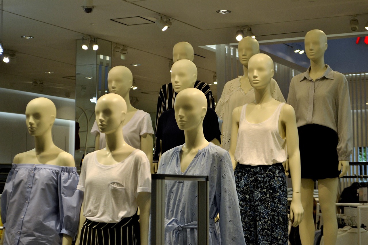
Mannequin Styling – Concept #
The art of dressing and positioning human forms to showcase apparel and accessories. Related terms: Visual Merchandising, Brand Storytelling. Explanation: Mannequins act as three‑dimensional canvases, conveying lifestyle cues and fit. Example: A street‑wear brand outfits a mannequin in layered denim, sneakers, and a branded cap, positioned against an urban graffiti backdrop. Practical application: Align mannequin poses with the season’s narrative, rotate outfits frequently to keep the display fresh. Challenges: Ensuring proper fit, preventing wear and tear, and adapting mannequins for inclusive sizing.
Merchandise Mix – Concept #
The assortment of product categories, price points, and styles presented in a retail space. Related terms: Product Assortment, Category Management. Explanation: A balanced mix meets diverse shopper needs while supporting profitability objectives. Example: A boutique offers premium, mid‑range, and entry‑level handbags to capture multiple market segments. Practical application: Review sales data to adjust the mix, introducing new lines when demand signals opportunity. Challenges: Limited shelf space, forecasting demand accurately, and avoiding cannibalization between similar items.
POS (Point‑of‑Sale) Displays – Concept #
Promotional fixtures located near the checkout area, designed to capture last‑minute buying decisions. Related terms: Impulse Displays, Graphic Signage. Explanation: POS displays leverage the shopper’s final attention window, often featuring small, inexpensive items with high impulse appeal. Example: A magnetic strip holding travel‑size toiletries adjacent to the register. Practical application: Use modular POS units that can be quickly rebranded for different campaigns. Challenges: Space constraints, maintaining compliance with checkout regulations, and ensuring displays do not obstruct transaction flow.
Product Placement – Concept #
The strategic location of items within a display or store to maximize visibility and sales. Related terms: Visual Hierarchy, Eye‑Level. Explanation: Placement decisions consider factors such as height, proximity to traffic, and complementary products. Example: Placing a new fragrance at eye‑level on a sidewall, flanked by matching scented candles. Practical application: Conduct A/B testing of placement variations to determine optimal positioning. Challenges: Competing for limited prime locations and adapting placement for seasonal changes.
Retail Architecture – Concept #
The structural design elements of a store that influence shopper experience and merchandising possibilities. Related terms: Store Layout, Interior Design. Explanation: Architecture determines sightlines, ceiling height, and fixture integration, shaping how visual merchandising can be executed. Example: A high‑ceiling boutique allows for tall, dramatic display units that showcase long‑form garments. Practical application: Coordinate with architects during renovation to embed merchandising considerations early. Challenges: Balancing aesthetic ambition with budgetary constraints and ensuring compliance with accessibility standards.
Seasonal Rotation – Concept #
The periodic updating of displays, fixtures, and product assortments to reflect seasonal themes or holidays. Related terms: Visual Refresh, Promotional Calendar. Explanation: Regular rotation keeps the environment fresh, aligns inventory with consumer demand cycles, and drives repeat visits. Example: Switching from spring pastel tones to autumnal earth tones in window displays. Practical application: Develop a master calendar that outlines key dates, then allocate resources for design, production, and installation. Challenges: Coordinating timing with supply chain lead times and avoiding over‑stock of out‑of‑season items.
Shelf Edge Labeling – Concept #
Small signs placed on the front edge of shelving to highlight product details, pricing, or promotions. Related terms: Graphic Signage, Price Tagging. Explanation: Edge labels capture attention at the point of decision, reinforcing key messages and encouraging purchase. Example: A brightly colored tag announcing “Buy One, Get One 50% Off” on a cereal aisle. Practical application: Use consistent typography and color schemes to maintain brand cohesion across all labels. Challenges: Ensuring labels are updated promptly to avoid misinformation and preventing visual clutter on densely packed shelves.
Signage Hierarchy – Concept #
The arrangement of signs based on importance, size, and placement to guide shopper attention. Related terms: Graphic Signage, Wayfinding. Explanation: A clear hierarchy ensures that primary messages dominate, while secondary information supports without overwhelming. Example: A large exterior marquee announces the store’s main promotion, while smaller interior signs direct shoppers to specific departments. Practical application: Create a signage matrix that defines font sizes, colors, and placement for each level of information. Challenges: Maintaining consistency across multiple locations and adapting hierarchy for multilingual markets.
Skinning (Digital Displays) – Concept #
The visual design overlay applied to interactive screens and kiosks. Related terms: Digital Signage, User Interface (UI). Explanation: Skins incorporate brand colors, fonts, and imagery, providing a cohesive digital experience that aligns with physical merchandising. Example: A touchscreen mirror in a fitting room displays a sleek, minimalist skin that matches the store’s overall aesthetic. Practical application: Update skins regularly to reflect promotions, ensuring seamless integration with hardware functionality. Challenges: Balancing visual appeal with usability, and managing software updates across multiple devices.
Storefront Window – Concept #
The primary visual interface between the retail environment and passersby, used to attract and inform. Related terms: Window Display, Anchor Display. Explanation: Effective windows combine storytelling, product focus, and lighting to create a compelling invitation. Example: A fashion retailer uses a cascading fabric backdrop and mannequins to showcase a new runway collection. Practical application: Rotate window themes weekly during high‑traffic seasons to maintain novelty. Challenges: Weather exposure, security concerns, and the need for quick changeover mechanisms.
Styling Props – Concept #
Non‑product items such as furniture, accessories, or decorative elements that enhance a display’s narrative. Related terms: Visual Narrative, Brand Storytelling. Explanation: Props add context, evoke lifestyle aspirations, and create depth. Example: A kitchenware display includes a rustic wooden cutting board, fresh herbs, and a vintage scale to suggest a farm‑to‑table experience. Practical application: Source props that are reusable, lightweight, and align with brand sustainability values. Challenges: Maintaining prop condition over repeated use and preventing props from overshadowing the actual merchandise.
Visual Hierarchy – Concept #
The ordered arrangement of visual elements that guides the viewer’s eye from most to least important. Related terms: Contrast, Focal Point. Explanation: Hierarchy is achieved through size, color, placement, and lighting, ensuring key messages are seen first. Example: A large, bold headline above a product image establishes primary focus, while smaller bullet points provide supporting details. Practical application: Sketch layout drafts that prioritize hierarchy before building the physical display. Challenges: Over‑emphasis on one element can diminish the impact of secondary items, and cultural differences may affect perceived importance.
Wayfinding – Concept #
The system of directional cues that help shoppers navigate a store’s interior. Related terms: In‑Store Navigation, Signage Hierarchy. Explanation: Effective wayfinding reduces confusion, improves flow, and enhances overall shopping experience. Example: Overhead arrows and floor‑level icons guide customers from the entrance to the electronics department. Practical application: Conduct usability testing with diverse shopper groups to refine wayfinding elements. Challenges: Maintaining consistency across large or multi‑level stores and updating wayfinding as layouts change.
Window Display – Concept #
A curated arrangement within a storefront window designed to attract attention and communicate a message. Related terms: Anchor Display, Storefront Window. Explanation: Window displays blend product placement, lighting, props, and signage to create a miniature stage. Example: A holiday display featuring a snow‑covered village scene with gift‑wrapped items placed in windows. Practical application: Develop a seasonal storyboard, assign a budget for materials, and schedule installation with enough lead time for permits if needed. Challenges: Weather damage, theft risk, and the need for rapid turnover between campaigns.
Zone Merchandising – Concept #
Dividing a retail space into distinct areas, each focusing on a specific product category or theme. Related terms: Store Layout, Visual Grouping. Explanation: Zoning creates logical pathways and simplifies the shopper’s decision process. Example: A home‑goods store separates “kitchen,” “living room,” and “outdoor” zones, each with dedicated signage and color cues. Practical application: Use floor markings and lighting differences to reinforce zone boundaries. Challenges: Managing cross‑zone traffic that may disrupt the intended flow, and ensuring each zone receives adequate visual emphasis.
Visual Merchandising – Concept #
The strategic presentation of products and brand messages to stimulate sales and enhance the shopper experience. Related terms: Store Layout, Brand Storytelling. Explanation: It encompasses window design, fixture selection, lighting, signage, and product placement, all aligned with marketing objectives. Example: A cosmetics retailer uses color‑coordinated lighting, mirrored fixtures, and scented ambient aromas to create an immersive beauty environment. Practical application: Conduct quarterly audits to assess the effectiveness of visual elements against sales data. Challenges: Balancing creativity with budget constraints, maintaining consistency across multiple locations, and adapting to rapidly changing consumer trends.
Window Lighting – Concept #
The illumination specifically directed at storefront windows to enhance visibility and mood. Related terms: Ambient Lighting, Accent Lighting. Explanation: Proper window lighting draws the eye, highlights product details, and extends display hours into the evening. Example: LED strip lights outlining a silhouette of a product shape create a dramatic night‑time effect. Practical application: Install programmable lighting controls to adjust intensity and color temperature based on time of day. Challenges: Energy consumption considerations, glare that may obscure product details, and ensuring lighting complies with local ordinances.
Zone Planning – Concept #
The process of allocating retail floor space to different functional areas, such as sales, storage, and customer service. Related terms: Floor Plan, Space Allocation. Explanation: Effective zone planning maximizes revenue per square foot while supporting operational efficiency. Example: A department store dedicates 40% of its floor area to high‑traffic “experience zones” while reserving 20% for back‑of‑house storage. Practical application: Use sales per square foot metrics to continuously refine zone sizes. Challenges: Physical constraints like columns or load‑bearing walls, and balancing the needs of multiple departments.
Visual Refresh – Concept #
A periodic update to the visual elements of a retail space to keep the environment engaging. Related terms: Seasonal Rotation, Storefront Window. Explanation: Refreshes may involve swapping signage, repositioning fixtures, or altering color schemes. Example: Updating a summer display with brighter hues and new product props as the season changes. Practical application: Schedule monthly mini‑refreshes to maintain shopper interest without major overhauls. Challenges: Coordinating updates across all store locations and managing the labor costs associated with frequent changes.